What I did:
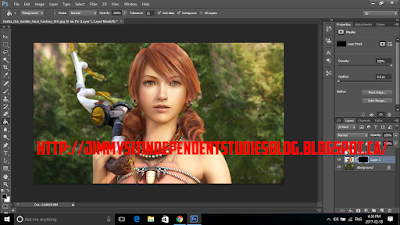
So, today I decided to continue with the dispersion effect. Yesterday, I did not like what I had created because it didn't look as great as I would have wanted. It didn't look natural but today, I created something that I am really proud of and that was the pixelated dispersion. It was sort of like the one I created yesterday but it had new concepts that came with it such as brush presets and square brushes. I used a picture of Vanille from Final Fantasy 13 (Yes, I know I use Final Fantasy pictures too much).
Before
After
1. I used the quick selection to select the character like I did yesterday and then I used the "layer via copy" option to put her into her own layer with the background. I then used the square selection tool to cut Vanille out of the background. After selecting her with the square selection tool, I right clicked and used the "fill" option to get rid of her from the background.
2. Then, I duplicated the layer with Vanille in it and used the lower layer as the morphing layer. I used the layer mask tool to stretch out the character then filled it in with black so it wouldn't show until I decide to use the brushes.
3. I then used the same techniques as yesterday to finish everything up which gave me the final product. I even gave the pixels a shadow so it gave the picture a portrait feel. I also used the wind style to give the pixels and rushed look and it makes it look like the picture was de-pixelating.
What I learned:
So, today I learned a few new things about dispersion and mainly pixelation dispersion. I learned about square brushes and brush presets. I didn't even know brush presets were a thing before I learned about pixel dispersion today. I also didn't know there were more options in photoshop for brushes but it turns out they were hidden in the brush options.
1. The first new thing I learned today was that I don't have to liquefy my image to get the dispersion, I can use the free transform tool to do it and I think I like it a lot more because it looks a lot better than the liquefy option.
2. I learned about square brushes and these are the brushes that helped me create the pixelated look. I learned that they were in the options menu in the brush options.
3. Then I learned about the brush presets. These presets were very helpful in that they choose the size of the pixelated look and you can also decide how many squares will appear when you left click to add it in. I also learned that you can add single squares at a time or you can hold down the left click to add multiple at a time but this can hinder your work by putting the squares in some place where you don't want them to go.
4. Finally, I learned about the wind effect. I have always wanted to learn how to do this and now I finally got the chance to. You go filters, then stylize, and finally the wind option. You can select which way the wind effect goes to make it look the way you want and to give the picture a forming look.
Final Product:
What I plan to learn tomorrow:
Tomorrow, I plan to learn how to add a dramatic sky effect to a picture. I will be following a long tutorial so that might as well take a few days to finish. I want to learn how to add a dramatic sky to a picture because I know companies use it for posters to promote stuff. I also think it makes a picture look a lot cooler because it adds that dark, stormy look to it which is what I plan to do tomorrow.


No comments:
Post a Comment