Sunday, 26 February 2017

Day 13 - Photoshop Keyboard Shortcuts

What I did:
Today, I learned some photoshop keyboard shortcuts. These shortcuts are obviously there for making it easier to maneuver around the program. First, I learned how to zoom in and out using the keys. I then learned about how to resize my brush using the keys. Next, I learned about how to use the number keys to lower or raise the opacity an image rather than going to the opacity option and "manually" doing it. After that, I learned how to give specific options their own keyboard shortcuts and that was very helpful for the future. Finally, I learned how to quickly go to the export section in photoshop.

What I learned:

1st: I learned how to zoom in with keys on the keyboard rather than the slower method which is going to the zoom tool and "manually" doing it. You have to hold "spacebar" and "Ctrl" and then you drag with your mouse to zoom in or zoom out. Right = zoom in. Left = zoom out.

2nd: I learned how to change the brush size. You can change the brush size with square bracket ([/]) keys but it is very slow. If you want do it on the move or faster, you hold down "CTRL" + "Alt" + RIGHT click to change it on the go. Try "zooming" to change the area of your brush.

3rd: Next, I learned how to change the opacity very quickly. You can use the numbers keys at the top of your keyboard to do it. If you want to start from a low opacity press "1" for 10% opacity. Then you can move up the keys to make it have more opacity.
4th: Then, I learned how to create keyboard shortcuts for specific options. You go to the edit menu and go all the way down to keyboard shortcuts. Then you can select whichever option you want to create a keyboard shortcut. Then you have hold down the keys that you want to create a shortcut with.
5th: Finally, I learned a really simple shortcut which is the shortcut to quickly go to the export menu. You hold down "CTRL" + "Shift" + "Alt" + "S" for the shortcut. This allows you to quickly export an image that you want to save. 


What I plan to learn tomorrow:
Tomorrow, I plan to learn how to create brushes in photoshop. I think this will be a neat tool to further help in photoshop. Rather than downloading brushes and using them, I'll be able to create my own brushes and use them. I think I will start off with making a snowflake brush because that is the tutorial that is available online. I will be able to use these new brushes in my own works of art. 


Day 12 - How to Add stars in Photoshop

What I did:
      Today, in Independent studies, I decided to learn how to add stars in Photoshop. This is a technique that you can use to add things to pictures in Photoshop. I wanted to learn this so I could add other things to pictures in Photoshop to make them either look better or just for fun. I decided to just do something basic like adding stars because fast and simple. It's a really quick technique that you can use in a matter of minutes.

Before:
After:

First, I brought an image of stars onto the picture of the prairie. I also put it at the top so the stars would reach the whole thing. I then changed the blend mode to screen.


Secondly, I duplicated my stars layer and made sure I could reach the ends of the picture. I then merged the layers to make them into one selective layer. 
Next,  I decided to create a new adjustment layer. With this layer, you can adjust the lighting of all the layers.
After that, I created a clipping mask, this clipping mask allowed me to adjust only the colours of the layer beneath it and not all the layers.
Finally, I adjusted the bar so the stars blended into the background and it looked very natural.
What I learned:
Today, I learned a lot about some tools in Photoshop. I learned that an adjustment layer is used for adjusting the colour for layers. This adjustment layer adjusts the colour for all the layers rather than just the layer that we need which the stars layer. We need it for the stars layer because that's the thing that needs to blend into the picture to make it look realistic so I also learned about the creating a clipping mask. The clipping mask is used for just adjusting the colours of the layers that is right below it, so I used this and created a group with it. I then adjusted the bar to make it blend in. The black icon changes the dark colours, the white bar changes the light colours and the middle bar changes both.

What I plan to learn tomorrow:
Tomorrow, I plan to learn something that doesn't involve editing a picture. Tomorrow, I plan to learn some keyboard shortcuts for photoshop. Since, I plan to use Photoshop for another two weeks, I think it would be beneficial that I learn more things about the program that would make it easier to use and I wouldn't waste as much time as I would if I didn't know about the shortcuts. That is my goal for tomorrow. 


Friday, 24 February 2017

Day 11 - How to add Light Rays to a picture

What I did:
     Today, I learned how to add light rays to pictures. I added light rays to a picture of a forest. Normally, light rays can be found coming through the clouds giving the image a heavenly feel but I wanted to try a forest because it looks really cool. The pictures that I used are here.

Before:

After:

1. First, I changed my brush presets and also changed up some of the brush mechanics when going into the brush options. I added scattering and shape dynamics. I moved the scatter all the way up to 1000% so the brush would be scattered around instead of being one fluid entity.

2. Next, I used the brush technique that I learned in my dispersion effect posts to add the brushes that I was using. Then, I added the radial blur which gave the light ray effect to the image. It can be found in "filters" then into "blurs" and then finally into "radial blurs."


3. Next, added another layer of rays and lowered the opacity of the first layer of rays because it was far too strong and looked unrealistic to some degree. So I decided to lower the opacity to 20 for the first layer and then combine both rays into one layer. 
4. I changed the mode to color dodge to give it a more dramatic feel and added some hue saturation to finish off.
                           

What I learned:
So, in today's class, I learned a bunch of things about light rays. I learned a few things about brushes and also learned a bunch of things about radial blurs. I also learned some keyboard shortcuts.

Keyboard shortcuts:
Merging layers - "Ctrl" + "E"
New layer via copy - "Ctrl" + "J"
Hue and Saturation - "Ctrl" + "U"

I learned that the scattering option in the brushes menu really helps with spreading the particles apart. Moving the scattering bar changes how much scatter is applied to the image. 

The most important thing I learned today was the radial blur portion of my time spent in Photoshop. I learned that you can change up how the blur works, you can make it into a spiral form if you want or keep it in the zoom form. The spiral form isn't what I used because I needed a ray form so I ended up using the zoom form. Also, I learned that you can place your blur in a position where you need it so I could place the blur in the middle at the top because that's where the sun was coming from and it gives that look to it when I applied it.
and this what happened:
What I plan to learn tomorrow:
Tomorrow, I plan to learn how to add stars in Photoshop. I will be learning how to add stars to a picture which has no stars in it. At the moment, I am just trying to learn some new things about Photoshop and the thing is, I am running out of ideas. I want to continue photoshop until spring break and after spring break I will start Adobe After Effects and that will be a really refreshing thing to do because I've never used it before but for now, I will continue with Photoshop and tomorrow, I'll learn how to add stars.


Day 10 - How to create a dramatic sky in Photoshop

What I did:
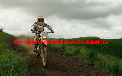
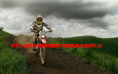
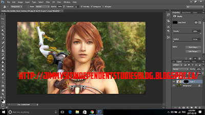
So, last time I said that creating a dramatic sky in a picture would take a few days but it turns out it was really easy and simple. That's what I did today and it's a very simple and helpful technique that you can use to create cool looking backgrounds to your images. I created the dramatic sky on a sample picture of a dirt biker. There isn't an insane change to the picture because I want to it be a little more realistic than just adding a blue sky to it.
                                                                       Before:


         After:


First, I used the magic wand tool to select the background to edit.

Then, I added created a group layer so I could edit the background and add more layers later on.
Next, I used the brush tool to add a black to the background. I did this so I could use the darkness to blend into the sky later on.

Then, I used the blending options to lighten the darkness and it gave it a gray and realistic feel.

Finally, I created this:

What I learned:
So, this time around, I learned a lot today. I mainly learned a lot more about the magic wand tool. I knew the basics of the magic wand tool but I learned a lot more about it and it really will help in the future. I also learned about grouping and the blending options while using photoshop.

Magic Wand Tool: So, I learned a lot more about the magic wand tool and one of the things I learned was the tolerance option. The tolerance option is at the very top when you select the tool itself and it can increase or decrease the amount of area you select when using the magic wand tool. So if you increase tolerance, it selects more area. If you decrease tolerance, it selects less area. I also learned that if you select something and it accidently selects a little bit of another item, you can use alt to decrease the amount you selected. I used this method with the lasso tool and it worked really well.
TO:

I also learned that you can press "q" while something is highlighted with the magic wand tool to highlight the area you selected. This area will show you in a much better way what you've selected. It highlights the picture much better so you can be more precise when you edit.
I also learned about the grouping thing. The grouping makes sure you can add multiple layers to a group and those things are not layered in a specific order so the  top thing will not overlay your bottom layer. This is especially helpful for this time of project when you're using lighter and darker brushes to lighten or darken your image. I also learned about the blending options bar. This bar helps. you with the clouds. You have to press "alt" to spit the arrow because if you don't you will get this:
But when you split it, you get this:

What I plan to learn tomorrow:
Tomorrow, I plan to learn how to add light rays to my pictures. I want to learn this because the effect makes a picture look much more dramatic and has a more serene feel to it. Light rays are usually seen coming through clouds but I will be learning how to make them come through a forest.


Saturday, 18 February 2017

Day 9 - Dispersion Effect (2/2) - Pixelation

What I did:
      So, today I decided to continue with the dispersion effect. Yesterday, I did not like what I had created because it didn't look as great as I would have wanted. It didn't look natural but today, I created something that I am really proud of and that was the pixelated dispersion. It was sort of like the one I created yesterday but it had new concepts that came with it such as brush presets and square brushes. I used a picture of Vanille from Final Fantasy 13 (Yes, I know I use Final Fantasy pictures too much).
                                                 
                                                                  Before


 After


1. I used the quick selection to select the character like I did yesterday and then I used the "layer via copy" option to put her into her own layer with the background. I then used the square selection tool to cut Vanille out of the background. After selecting her with the square selection tool, I right clicked and used the "fill" option to get rid of her from the background. 

2. Then, I duplicated the layer with Vanille in it and used the lower layer as the morphing layer. I used the layer mask tool to stretch out the character then filled it in with black so it wouldn't show until I decide to use the brushes. 


3. I then used the same techniques as yesterday to finish everything up which gave me the final product. I even gave the pixels a shadow so it gave the picture a portrait feel. I also used the wind style to give the pixels and rushed look and it makes it look like the picture was de-pixelating. 


What I learned:
So, today I learned a few new things about dispersion and mainly pixelation dispersion. I learned about square brushes and brush presets. I didn't even know brush presets were a thing before I learned about pixel dispersion today. I also didn't know there were more options in photoshop for brushes but it turns out they were hidden in the brush options. 

1. The first new thing I learned today was that I don't have to liquefy my image to get the dispersion, I can use the free transform tool to do it and I think I like it a lot more because it looks a lot better than the liquefy option.
                                                         

2. I learned about square brushes and these are the brushes that helped me create the pixelated look. I learned that they were in the options menu in the brush options. 
                                 
3. Then I learned about the brush presets. These presets were very helpful in that they choose the size of the pixelated look and you can also decide how many squares will appear when you left click to add it in. I also learned that you can add single squares at a time or you can hold down the left click to add multiple at a time but this can hinder your work by putting the squares in some place where you don't want them to go. 
                          

4. Finally, I learned about the wind effect. I have always wanted to learn how to do this and now I finally got the chance to. You go filters, then stylize, and finally the wind option. You can select which way the wind effect goes to make it look the way you want and to give the picture a forming look. 


Final Product:
What I plan to learn tomorrow:
      Tomorrow, I plan to learn how to add a dramatic sky effect to a picture. I will be following a long tutorial so that might as well take a few days to finish. I want to learn how to add a dramatic sky to a picture because I know companies use it for posters to promote stuff. I also think it makes a picture look a lot cooler because it adds that dark, stormy look to it which is what I plan to do tomorrow. 

Day 8 - Dispersion Effect (1/2) - The Basics

What I did:
                Today, I decided to learn the dispersion effect. The dispersion effect is used to make a fading/pixelating/explosion effect on an image. I used a picture of Noctis from Final Fantasy 15 as a subject for this project. I ended up doing it but it did not turn out how I wanted it to. I will also continue this project for the next few days to improve my abilities and learn more about it.

                                                               Before:
                           
After:

              
          I do not like how this final product turned out because it doesn't look as natural as I would have liked it to look. However, through this experience today, I learned a lot about dispersion and even learned some new techniques.

What I learned:
      I learned many new things today in Photoshop. The general thing I learned was the dispersion effect and the dispersion effect isn't a tool in Photoshop. It is something you have to create by using a lot of things in Photoshop.

              First, I learned about the lasso tool. The lasso tool can be used to outline and isolate the background. That is exactly what I learned and used it for.
                                     

Then filled it in to get rid of it from the background.

Next, I learned about the layer mask tool which allows me to liquefy and move the image to a different area by warping it around. The liquify tool is used for the effect in that when you use your brushes, it takes the liquefied area to add to the effect. The layer mask tool lets you hide the liquefied area behind your regular image.


Finally, I learned about the brushes and how they work. You have to select the brush you would like to use and have your foreground colours be white and black. Then you take the your brush that you want to use and on the top layer, you need to select white while on the lower layer with the liqufied image you need to pick black so it shows bits and pieces of the liquefied image to give it that dispersion look. Then all you do is, brush where you want it to have the effect (eg : right or left of the image)


Then on the bottom layer, it gave me this final product :


What I plan to learn tomorrow:
     Tomorrow, I plan to continue with the dispersion effect. However, I want to learn about making a pixelated fade rather than just a fade that I did today. The pixelated fade looks a little more complex but it seems like it would like better and it different steps than the one I did today. That is my goal for tomorrow.